Wellbeing
Problem Statement
Practitioners Statement: How can we simplify the wellbeing directory to enable practitioners to upload content seamlessly?
Customers Statement: How can we ease the flow for users to browse the website and confidently enquire about such services?
Research
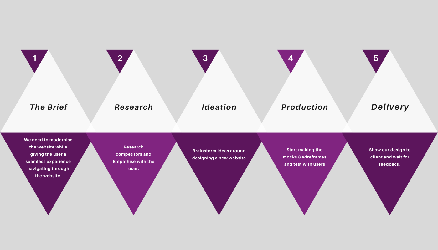
Primary research began by interviewing two types of end users (users browsing the site and users uploading the content/listing to the website). These interviews were carried out with both types of users. Early concept designs were made using the feedback received. Testing was carried out with paper designs, focusing on the usability of uploading listing for the practitioners. I referred back to the NN Group while designing the paper mockups. Further research was done via researching competitors and reading articles to find the most suitable solution.
Competitor Research
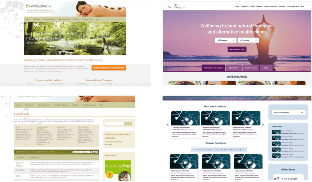
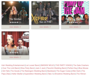
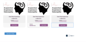
One of the features that stood out the most on the weddings online website was how weddings online displayed the two different membership options on the suppliers’ page. The paid membership had a container/box showing the service’s contact details. To view the free membership on weddings online, users had to click a button at the bottom of the page to display the free services in a list. When I compare the weddings online website to the old wellbeing website. Wellbeing memberships free and paid memberships were displayed in containers/boxes on the page. I think adding this feature to the wellbeing practitioners page will incase sales on the platform membership
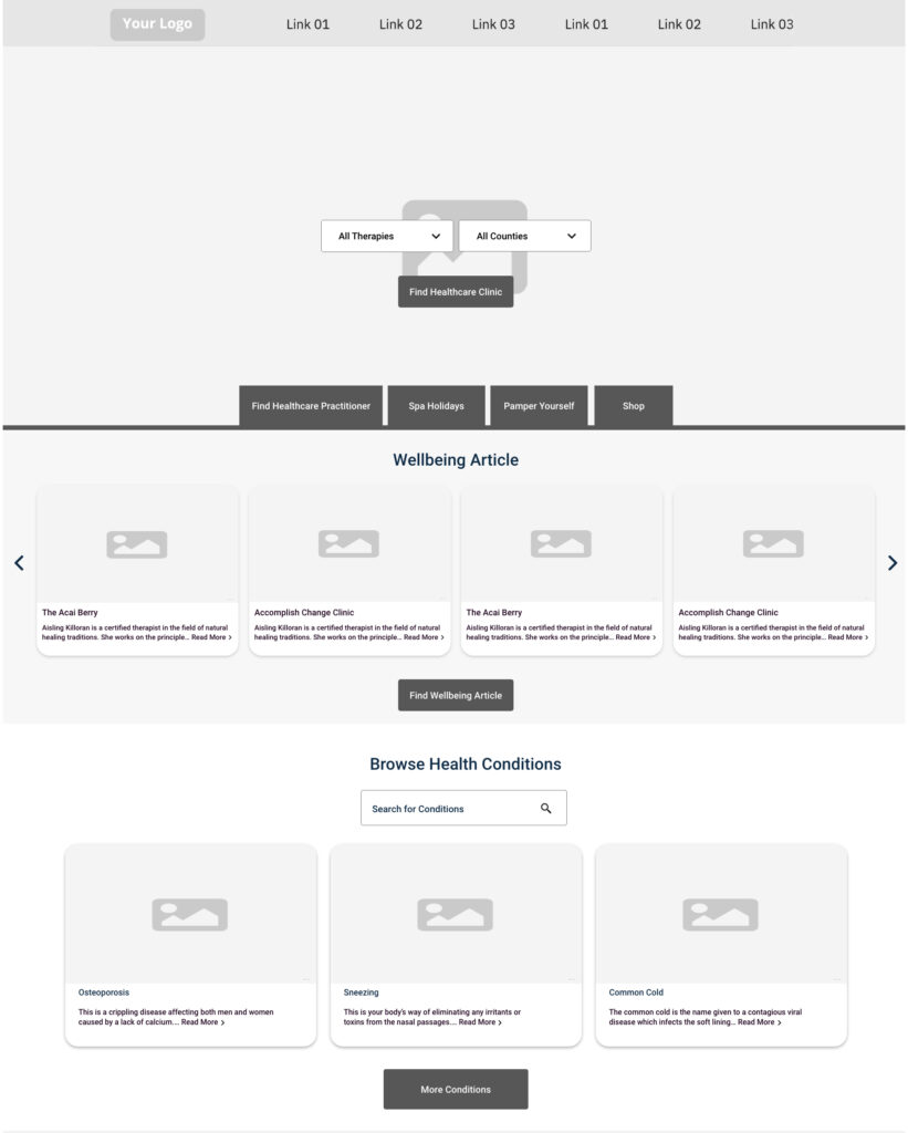
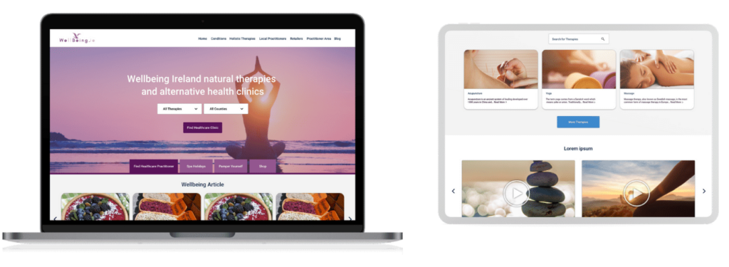
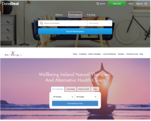
I wanted to add a search bar to the homepage banner of the new wellbeing website. Having this new feature would increase a seamless experience for the customer to search through the website. I used the Donedeal approach to help me display a suitable search bar with different tabs. Like Donedeal, Wellbeing needed to show a few different search fields relating to different options on the website. It made sense to have four different tabs above the search bar. If a customer clicked one of these tabs the banner and search field would change.
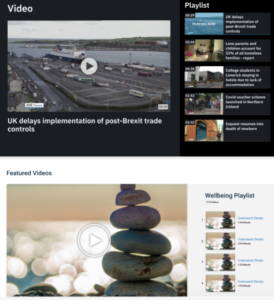
The client wanted to showcase a video section on the homepage. After reaching a number of websites. RTE stood out to me how they displayed their videos on the homepage. It was a seamless experience navigating through the different videos on the slider. I wanted the Wellbeing video feature to be designed in a similar way.
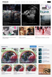
The client wanted the homepage of the Wellbeing website to be a hub spot for information. To achieve this design, I researched different news and magazine websites. One of the websites that inspired me was Frieze. I liked how they displayed some of their articles in a grid format. I wanted to showcase a similar section on the wellbeing homepage. The idea behind this was to present a few different new feeds from the Wellbeing website without overloading the user with too much information at once.
Persona
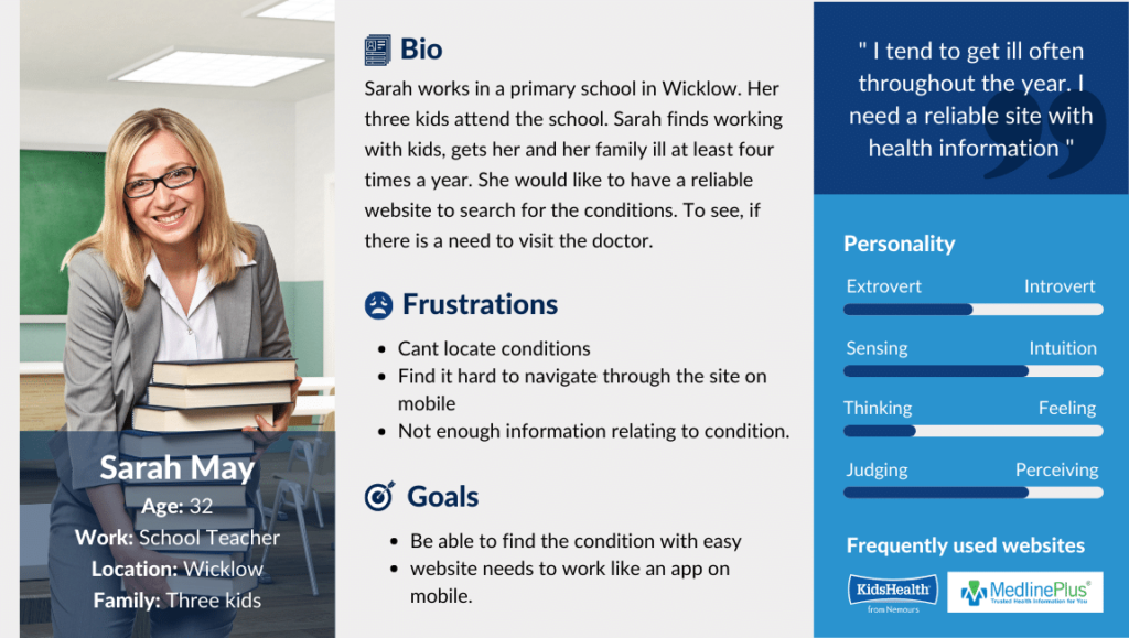
A persona was made based upon the research data collected when understanding the end users. This was done to further empathise with the end users by understanding the user’s needs, experiences, behaviours and goals.
Information Architecture
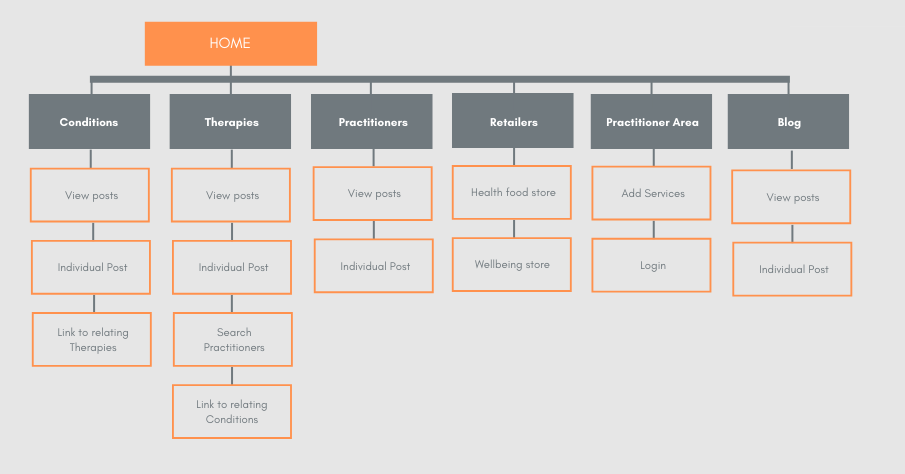
The old website ranked well on Google. It was an important factor to consider when designing the new website, to ensure the website maintained its ranking. This was done by keeping the current sitemap and URL structure the same. I made a sitemap on Adobe XD to help visualise the website structure. Making this map helped with the website flow and allowed to test the UI/UX whilst understanding the websites navigation.
Design Systems
Branding
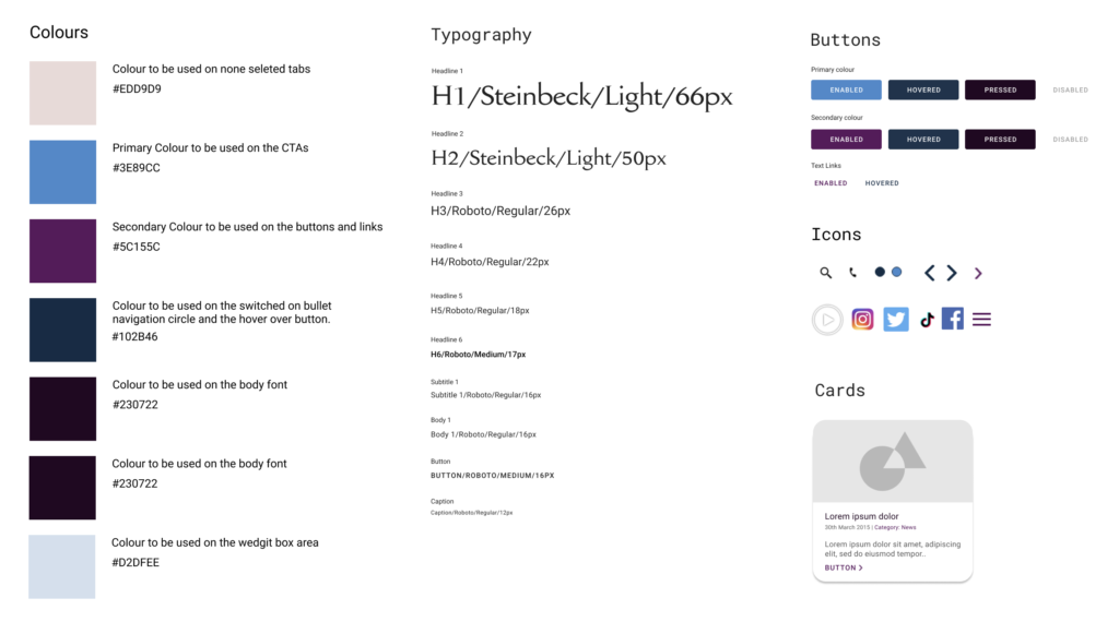
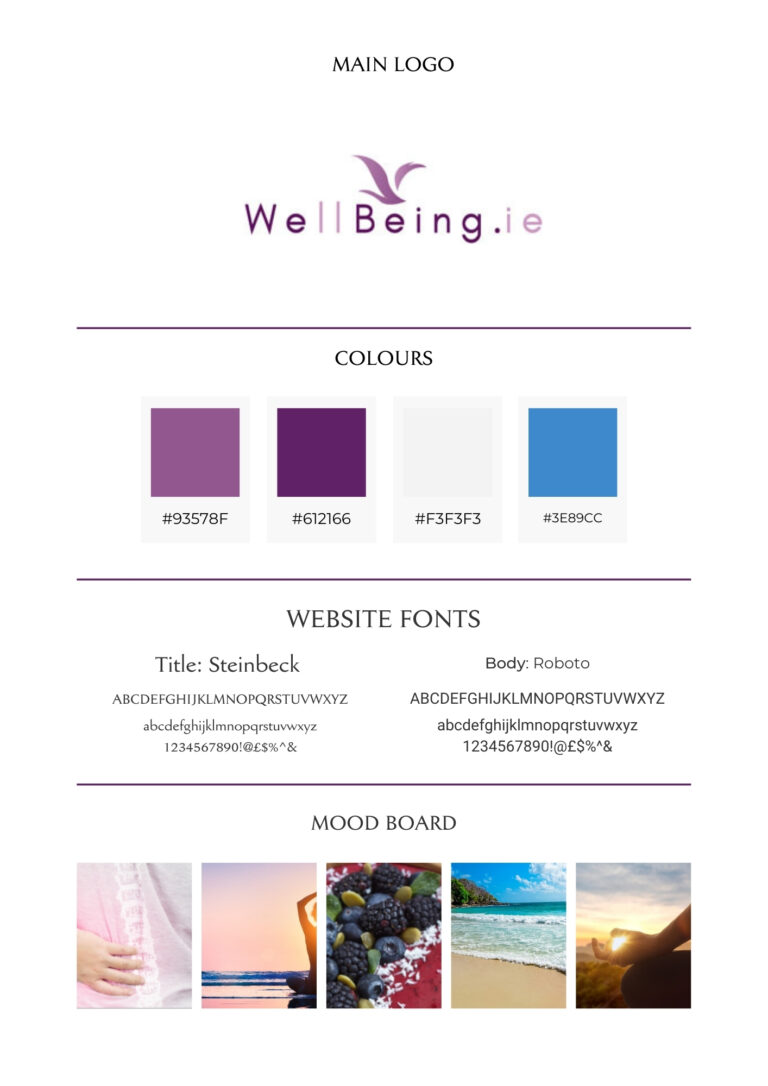
The logo created was a collaborated effort within the team. It was key to use the new branding colours throughout the website for consistency. Purple was chosen because it represents ambition and devotion, which are words associated with the set of end users. Blue was added as a complimentary colour and to invite users into the site and grey was added to add further depth. Steinbeck font was chosen for the titles and Roboto for the body font due to its’ easy to read nature.The images chosen for the website were chosen with the theme of relaxing and calamity in mind. It was important to ensure the user was not overwhelmed while browsing the website and that the experience was enjoyable.
Low-Fi Mock up
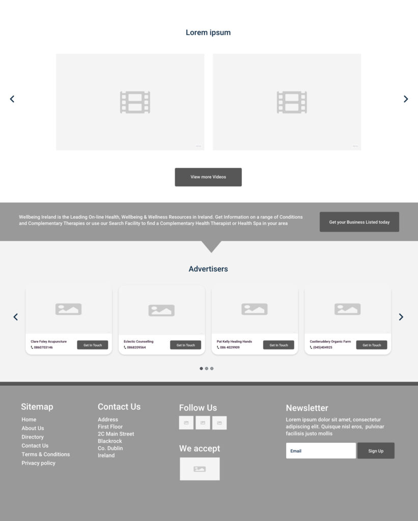
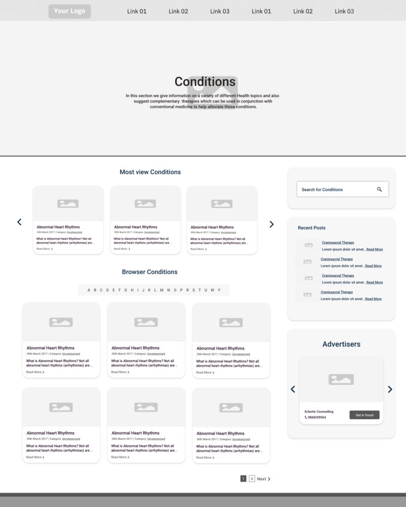
A low fidelity prototype was created using Miro after testing the paper prototype. This was done to perfect the websites navigation and information architecture. These iterative steps were done with the NNGroups Design thinking model in mind.
Hi-fi Mobile Mock up
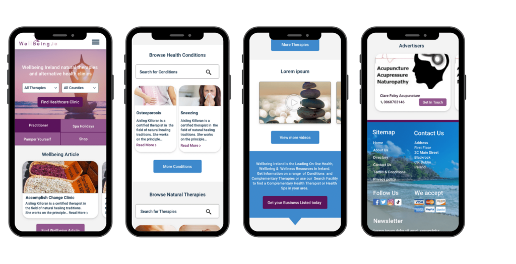
Upon the feedback collected from users using the low-fidelity prototype a high-fidelity prototype was made for a mobile. This was due to Google’s rank system because if a mobile website has a high ease of use for users, this translates to a better Google ranking.
Old website compared to new website
Development
I migrated the wellbeing website onto our new server and then made a subdomain for the demo website. The website is being built with WordPress with a custom theme. The custom theme is being built by a developer. During this process, I have been working alongside the developer to achieve the finish design.