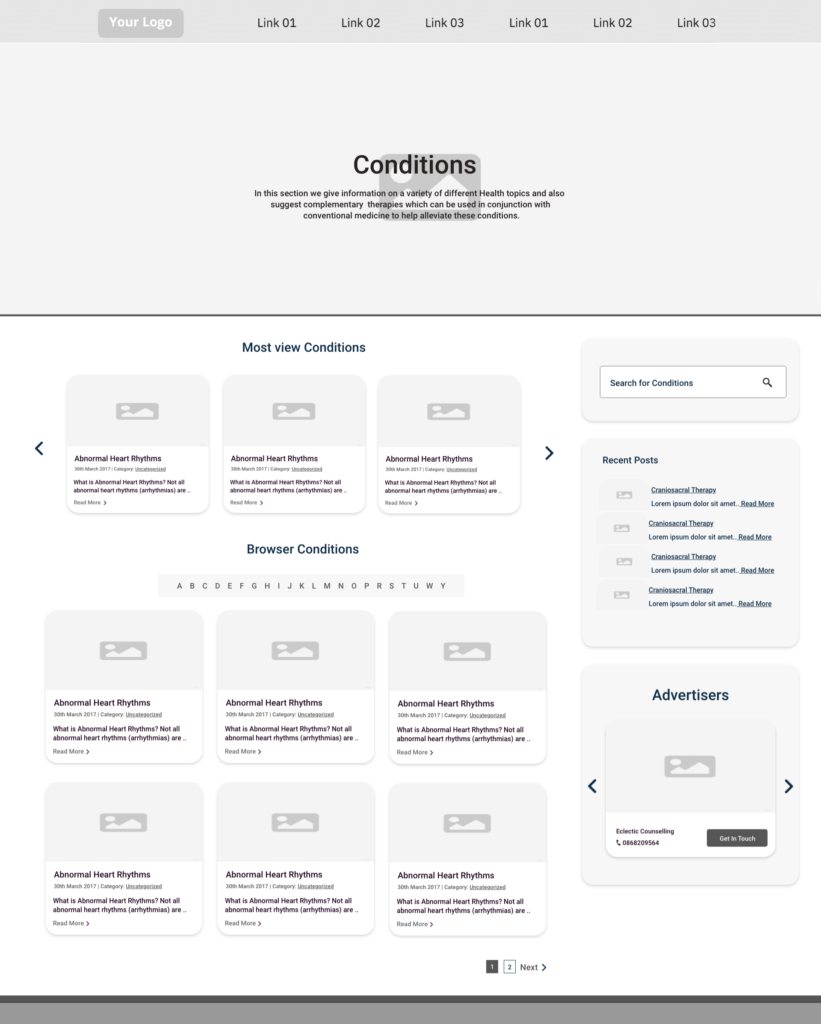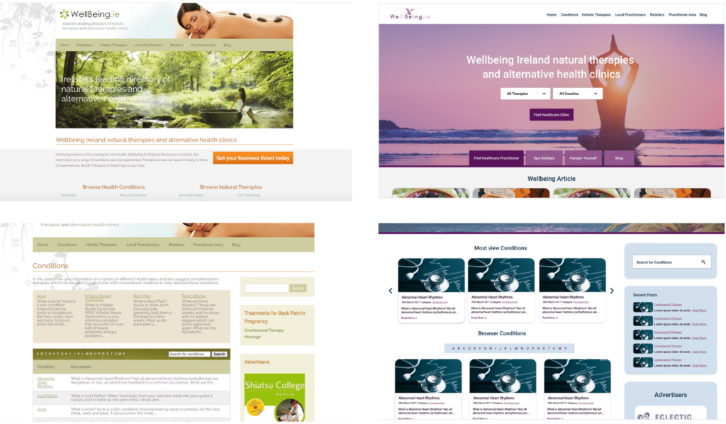
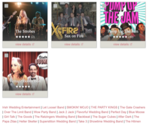
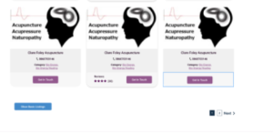
One of the features that stood out the most on the weddings online website was how weddings online displayed the two different membership options on the suppliers’ page. The paid membership had a container/box showing the service’s contact details. To view the free membership on weddings online, users had to click a button at the bottom of the page to display the free services in a list. When I compare the weddings online website to the old wellbeing website. Wellbeing memberships free and paid memberships were displayed in containers/boxes on the page. I think adding this feature to the wellbeing practitioners page will incase sales on the platform membership
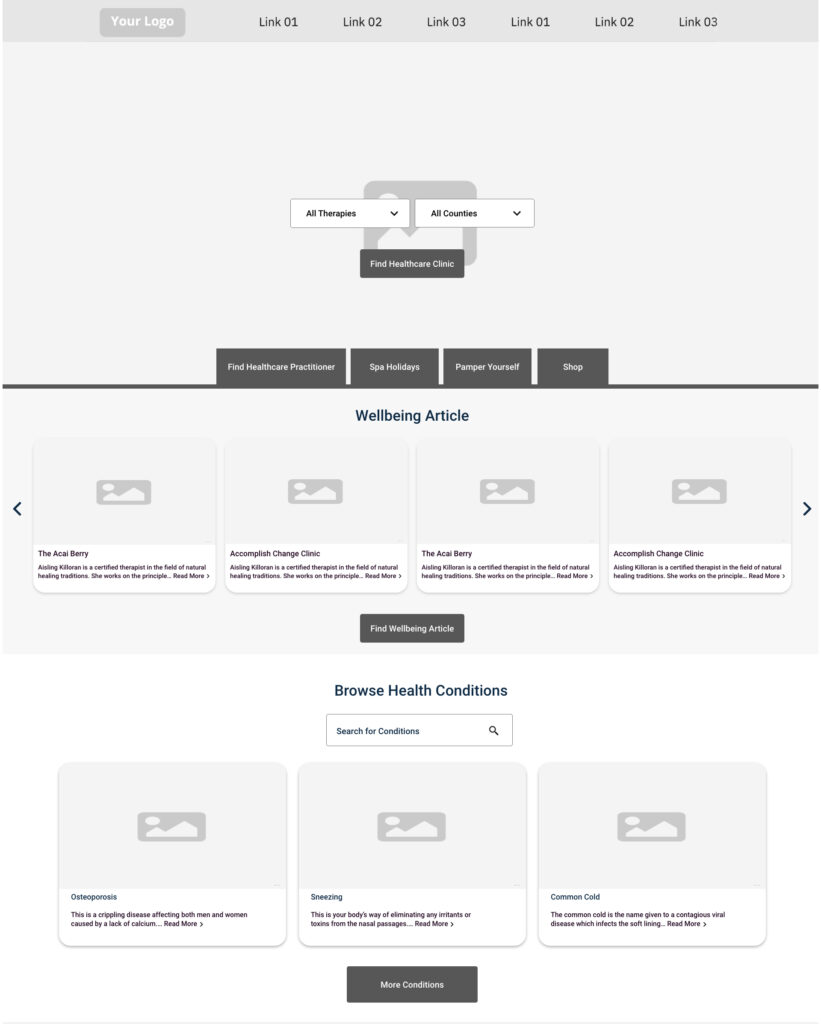
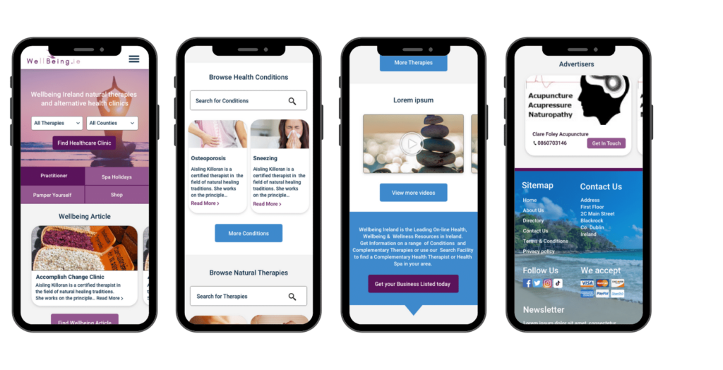
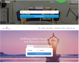
I wanted to add a search bar to the homepage banner of the new wellbeing website. Having this new feature would increase a seamless experience for the customer to search through the website. I used the Donedeal approach to help me display a suitable search bar with different tabs. Like Donedeal, Wellbeing needed to show a few different search fields relating to different options on the website. It made sense to have four different tabs above the search bar. If a customer clicked one of these tabs the banner and search field would change.
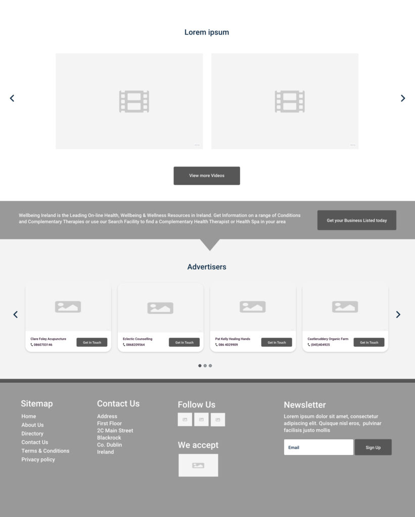
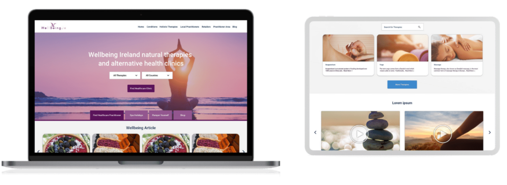
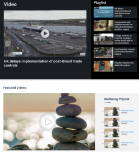
The client wanted to showcase a video section on the homepage. After reaching a number of websites. RTE stood out to me how they displayed their videos on the homepage. It was a seamless experience navigating through the different videos on the slider. I wanted the Wellbeing video feature to be designed in a similar way.
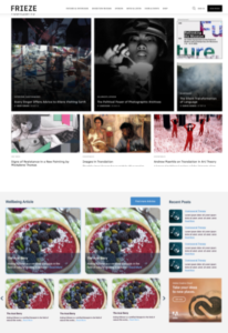
The client wanted the homepage of the Wellbeing website to be a hub spot for information. To achieve this design, I researched different news and magazine websites. One of the websites that inspired me was Frieze. I liked how they displayed some of their articles in a grid format. I wanted to showcase a similar section on the wellbeing homepage. The idea behind this was to present a few different new feeds from the Wellbeing website without overloading the user with too much information at once.